India presenting pretty trophies at prizes is as rare as India winning gold at the Olympics. Don't believe us, then take a look at these hideously designed trophies and you'll know what we mean!
When India hosts a big sporting event like the Formula One GP, everything is expected to go to plan. The logistics involved are huge and organisation calls for precision. More or less, like the engines on the track, all was proper at the Buddh International circuit over the weekend.
But, hang on! Did we spot a glitch? Maybe, yes!
They take the prize for worst designed trophies
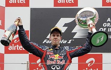
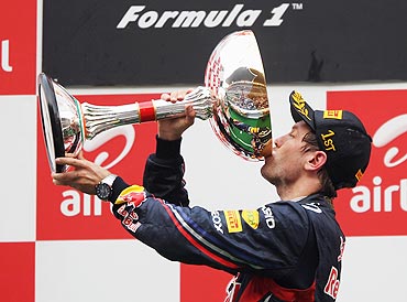
Image: Red Bull's Sebastian Vettel drinks champagne from the trophy after winning the Indian GPWhat's with that trophy? The one handed over to the champion? Wasn't it supposed to be the replica of the Qutub Minar? Or one that represents domes of Hindu temples and the Taj Mahal?
Then what was that 'Plain Jane' doing in the arms of Sebastian Vettel. Did we miss something here?
Well, whether that question gets answered or no, only time will tell, but one thing is for sure: India's legacy of presenting lackluster-designed trophies continues.
They take the prize for worst designed trophies
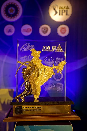
Image: IPL trophyDon't believe it? Then look at the trophy handed out to the winners of the IPL. Is there a need to be so obvious about whose tournament it is? Perhaps, they must have really run out of design ideas.
A map of India-inspired trophy, wow! That's really patriotic.
And why is there only a batsman crafted on the trophy? Isn't T20 cricket a bowler's game too?
They take the prize for worst designed trophies
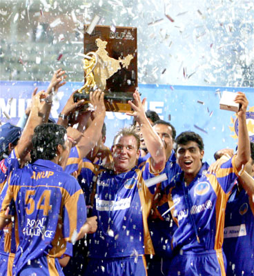
Image: IPL season 1 champs Rajasthan Royals at the presentation ceremonyHave to hand it to that ingenious designer for really wracking his brains and coming out with the winning design. It looks more apt as a symbol of a political party for the next general elections.
And, don't think it took much for IPL organizers to give it a final nod. Well, doesn't cricket promote patriotism, equality and all that jazz? Perfecto then!
They take the prize for worst designed trophies
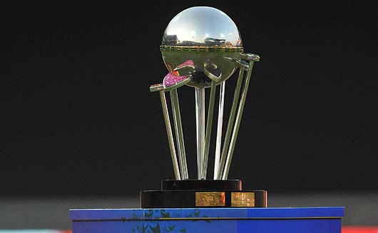
Image: The inaugural Champions League T20 trophyWait, there's morel! Embarrassment? Or, should we say, designs from out of the world waiting to grab our attention. The Champions League T20, a BCCI initiative, has been played across three seasons so far. Not that it's been a rage among spectators, but, come on, if you are going to be organizing an event of international standard, don't the winners of the tournament deserve something better-looking to adorn their trophy shelves?
Over the three seasons the Champions League T20 has seen varied designs. The trophy unveiled in 2009, the inaugural season was also presented in the following season.
They take the prize for worst designed trophies
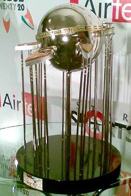
Image: Champions League T20 trophyIt has to be one of the weirdest designs ever seen! Well, maybe, it was one way of making viewers curious about the tournament. Certainly, not the way to grab attention!
An eye-sore in the name of design, terming the trophy hideous will be an understatement. The trophy was made of metals, studded with 5.12 carat diamonds and precious and semi-precious gemstones and stood 1.5 feet tall, weighing just over 6 kg.
They take the prize for worst designed trophies
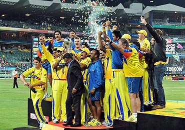
Image: The Chennai Super Kings celebrate with the trophy after winning the 2010 Champions League Twenty20 finalImpressive, it may seem, but did all that glitter make a difference to the overall design of the trophy? Guess not! What looks like ugly, stiff tassels all over, the trophy must have been made keeping in mind the need for all the players to have a feel of the prize together at the presentation ceremony. How very thoughtful!
Looking at the picture of the trophy, one is forced to applaud the person's taste and knowledge for design. Kudos to you for bringing to us a trophy that could be in contention for worst trophy designs of the century!
They take the prize for worst designed trophies
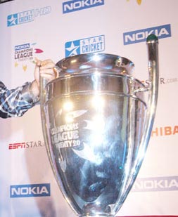
Image: The 2011 Champions League T20 trophyFor the 2011 season, the look of the trophy was completely altered. Thank God for small mercies! As Mumbai Indians clinched the tournament last month, captain Harbhajan Singh and his teammates did a lap of honour with a huge trophy in hand.
But wait, that's a rip-off! The design is a copy of THE Champions League -- the original, UEFA football tournament. Well, the name's been copied, what's the big deal about copying the look of the trophy, no?
For the future, let's hope Indian sports organizers put a little more thought into creating designs that are simplistic, yet charming.

Comment
article