 | « Back to article | Print this article |
Can you identify these brand logos?
A logo is an integral part of a company's corporate identity. A uniquely customised logo design can intensify your company's identity, and help you to acquire instant recognition. Take this quiz to find out if you can identify these logos:
1) Ben & Jerry's
2) Kwality Walls
3) Haagen-Dazs
The correct answer is Kwality Walls
Kwality Wall's adopted the international heartbrand in 2001. Their version is however somewhat different as the the two hearts aren't connected.
Kwality Walls
Kwality Wall's adopted the international heartbrand in 2001. Their version is however somewhat different as the the two hearts aren't connected.
Can you identify these brand logos?
1) MRF Tyres
2) Ceat Tyres
3) Michelin
The correct answer is MRF Tyres
The MRF muscleman was born in 1964. Through these years, the famous muscleman went under a lot of changes proving a silent testimony to the group's indomitable strength.
MRF Tyres
The MRF muscleman was born in 1964. Through these years, the famous muscleman went under a lot of changes proving a silent testimony to the group's indomitable strength.
Click NEXT to read more...
Can you identify these brand logos?
1) Whirlpool
2) GE
3) LG
The correct answer is LG
The company logo of LG features the letters "L" and "G", presented in the form of a smiling human face. It was later noticed by members of the Internet community that if the L in the logo were to be moved upwards to match the rest of the logo, then the logo turns into a Pacman shaped object.
LG
The company logo of LG features the letters "L" and "G", presented in the form of a smiling human face. It was later noticed by members of the Internet community that if the L in the logo were to be moved upwards to match the rest of the logo, then the logo turns into a Pacman shaped object.
Click NEXT to read more...
Can you identify these brand logos?
1) McDonald's
2) KFC
3) Pizza Hut
The correct answer is McDonald's
The famous Golden Arches in McDonald's logo represent style, significance and a strong corporate identity. It was created by Jim Schindler in 1962 and the idea was first introduced by Dick and Mac McDonald as arch shaped signs on the sides of their then 'walk-up hamburger stand'.
McDonald's
The famous Golden Arches in McDonald's logo represent style, significance and a strong corporate identity. It was created by Jim Schindler in 1962 and the idea was first introduced by Dick and Mac McDonald as arch shaped signs on the sides of their then 'walk-up hamburger stand'.
Click NEXT to read more...
Can you identify these brand logos?
1) Audi
2) Porsche
3) Ferrari
The correct answer is Ferrari
The Prancing Horse was a symbol used by Count Francesco Baracca, who was an ace fighter pilot of Italian Air Force during World War 1. He died young, fighting fearlessly. He was shot down after 34 dual and team victories.
Ferrari
The Prancing Horse was a symbol used by Count Francesco Baracca, who was an ace fighter pilot of Italian Air Force during World War 1. He died young, fighting fearlessly. He was shot down after 34 dual and team victories.
Click NEXT to read more...
Can you identify these brand logos?
1) Citibank
2) ABN Amro
3) Deutsche Bank
The correct answer is ABN Amro
The green and yellow shield logo was designed by the design house Landor Associates for ABN AMRO in 1991 and has been used as a brand for the bank and all its subsidiaries.
ABN Amro
The green and yellow shield logo was designed by the design house Landor Associates for ABN AMRO in 1991 and has been used as a brand for the bank and all its subsidiaries.
Click NEXT to read more...
Can you identify these brand logos?
1) BP
2) HPCL
3) Indian Oil
The correct answer is BP
The Helios logo is designed to represent energy in its many forms. BP's tagline, "Beyond Petroleum", according to the company represents their focus on meeting the growing demand for fossil fuels, manufacturing and delivering more advanced products, and enabling the material transition to a lower carbon future. BP is a British multinational oil and gas company headquartered in London, United Kingdom.
BP
The Helios logo is designed to represent energy in its many forms. BP's tagline, "Beyond Petroleum", according to the company represents their focus on meeting the growing demand for fossil fuels, manufacturing and delivering more advanced products, and enabling the material transition to a lower carbon future. BP is a British multinational oil and gas company headquartered in London, United Kingdom.
Click NEXT to read more...
Can you identify these brand logos?
1) BPL Mobile
2) Vodafone
3) Airtel
The correct answer is Vodafone
In 1997 Vodafone introduced its new corporate Speechmark logo. This represents a quotation mark within a circle. With the 'O's in the Vodafone logotype being opening and closing quotation marks, suggesting conversation.
Vodafone
In 1997 Vodafone introduced its new corporate Speechmark logo. This represents a quotation mark within a circle. With the 'O's in the Vodafone logotype being opening and closing quotation marks, suggesting conversation.
Click NEXT to read more...
Can you identify these brand logos?
1) Starbucks
2) Dunkin' Donuts
3) Barista
The correct answer is Starbucks
In January 2011, Starbucks announced that they would make small changes to the company's logo, removing the Starbucks wordmark around the siren, enlarging the siren image, and making it green.
Starbucks
In January 2011, Starbucks announced that they would make small changes to the company's logo, removing the Starbucks wordmark around the siren, enlarging the siren image, and making it green.
Click NEXT to read more...
Can you identify these brand logos?
1) Sony Ericsson
2) Micromax
3) Motorola
The correct answer is Motorola
In June 1955 Motorola introduced a new brand logo, the stylized "M" insignia, or "emsignia." A company leader said the two aspiring triangle peaks arching into an abstracted "M" typified the progressive leadership-minded outlook of the company.
Motorola
In June 1955 Motorola introduced a new brand logo, the stylized "M" insignia, or "emsignia." A company leader said the two aspiring triangle peaks arching into an abstracted "M" typified the progressive leadership-minded outlook of the company.
Click NEXT to read more...
Can you identify these brand logos?
1) Maserati
2) Ford
3) Mercedes-Benz
The correct answer is Maserati
The Maserati badge is a good example of owner's pride - the trident is the traditional symbol of Bologna, where the cars were originally made.
Maserati
The Maserati badge is a good example of owner's pride - the trident is the traditional symbol of Bologna, where the cars were originally made.
Click NEXT to read more...
Can you identify these brand logos?
1) BPCL
2) Chevron
3) Shell
The correct answer is Shell
This is a logo of the US-based oil company, Shell. The evolution of the logo began after 1915, when rendering enabled the company to reproduce its identity easily. This is visible in the 1930 logo for the company. When the company started a project in California, it added the red and yellow colours to the symbol. The colours help Shell to stand out.
Shell
This is a logo of the US-based oil company, Shell. The evolution of the logo began after 1915, when rendering enabled the company to reproduce its identity easily. This is visible in the 1930 logo for the company. When the company started a project in California, it added the red and yellow colours to the symbol. The colours help Shell to stand out.
Click NEXT to read more...
Can you identify these brand logos?
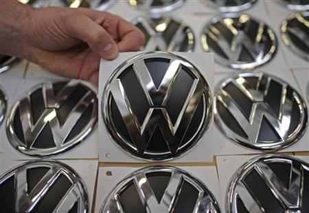
1) Volkswagen
2) Holden
3) Acura
The correct answer is Volkswagen
The first logo was designed by Franz Xavier Reimspiess, a Porsche employee during an office logo design competition. The main part of the logo hasn't changed much, but understandably after the WWII, they got rid of the design around the circle which seems to be inspired from the Nazi flag.
Volkswagen
The first logo was designed by Franz Xavier Reimspiess, a Porsche employee during an office logo design competition. The main part of the logo hasn't changed much, but understandably after the WWII, they got rid of the design around the circle which seems to be inspired from the Nazi flag.
Click NEXT to read more...
Can you identify these brand logos?
1) BMW
2) Mazda
3) Rolls-Royce
The correct answer is Mazda
Mazda's first logo in 1934 was a simple yet stylish typeface of its brand name. Two years later, Mazda altered its logo to that of a triple 'M', made to shape like a wing to signify its ability to reach new peaks. The logos that follow next were all enclosed by a circle/oval, with the latest one in 1997 bearing some resemblance to the winged logo in 1936.
Mazda
Mazda's first logo in 1934 was a simple yet stylish typeface of its brand name. Two years later, Mazda altered its logo to that of a triple 'M', made to shape like a wing to signify its ability to reach new peaks. The logos that follow next were all enclosed by a circle/oval, with the latest one in 1997 bearing some resemblance to the winged logo in 1936.
Click NEXT to read more...
Can you identify these brand logos?
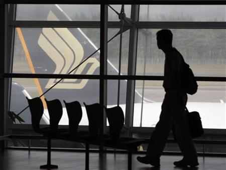
1) British Airways
2) Jet Airways
3) Singapore Airlines
The correct answer is Singapore Airlines
The first Singapore Airline logo was born in 1980s. Since then only a few slight color changes on the logo.
Singapore Airlines
The first Singapore Airline logo was born in 1980s. Since then only a few slight color changes on the logo.
Your score is: 0 out of 15
Click NEXT to read more...
