 | « Back to article | Print this article |
Samsung Galaxy S III: First Impressions
Love at first sight? Here's what it feels like spending some time with Samsung Galaxy S III.
Finally! The Samsung Galaxy S III has been launched in India, at the Samsung Galaxy S III World Tour event in New Delhi today.
The Galaxy S III, as Samsung's flagship, is the first phone from the South Korean giant's stables to be powered by the quad-core Exynos 1.4GHz processor, coupled with 1GB of RAM.
The 4.8-inch HD Super AMOLED display comes with a resolution of 1280 x 720 pixels.
The S III model launched in India is the 16GB version, with the card slot allowing you to expand that by 64GB more. The 8MP camera has burst mode, and offers the suggestion of what it thinks is the 'Best Picture'. Samsung say it has zero shutter lag, but we will believe it when we test it.
Amidst all the excitement, we managed to spend some time with the phone, and here is what we feel...
Samsung Galaxy S III: First Impressions
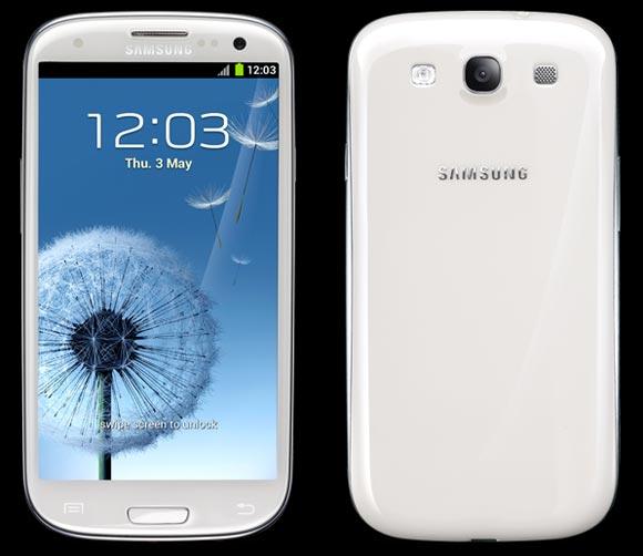
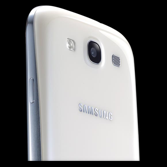
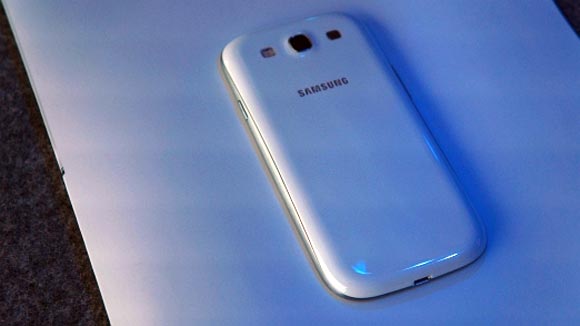
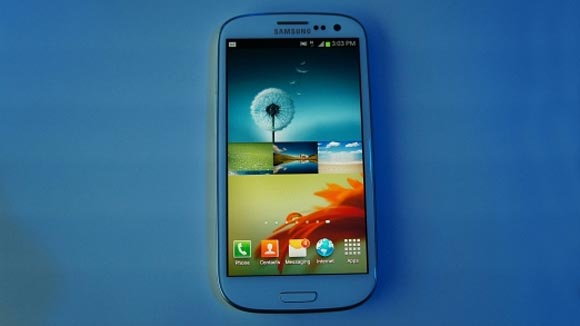
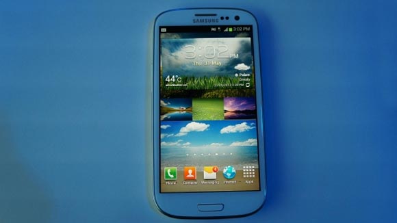
The Galaxy S III feels very classy. All the complaints of it being 'plasticky', well, we don't believe in them anymore. Okay, the material used is plastic, but it does have a classy, solid and premium feel to it. The phone that we got to check out was the Marble White one. The enamel white finish was extremely good, with a dollop of shine to it.
Excellent to hold and use, and undoubtedly has a premium feel to it. The 4.8-inch display means it falls straight in the 'big-screen' category, but we didn't think it was either too big or uncomfortable to use with the same hand holding it.
The power key as well as the volume rocker are on either side. The micro USB port is on the bottom. Flip the phone over, and there is the 8MP camera along with the LED flash, placed towards the upper half. However, this is a lot more comfortable placement (while taking a video, with the camera in landscape mode) than some phones offer, for example, the Sony Xperia S.
Samsung Galaxy S III: First Impressions
Speaking of which, the display is absolutely fantastic. Carrying forward the trend set by the Galaxy S II and the Galaxy Note, the S III's display is extremely vivid. We felt it was crisper as well, when compared to the predecessors. We shall confirm that once we test the S III in detail.
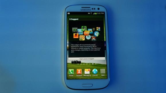
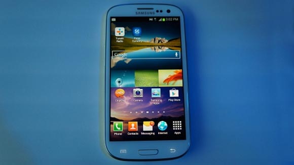
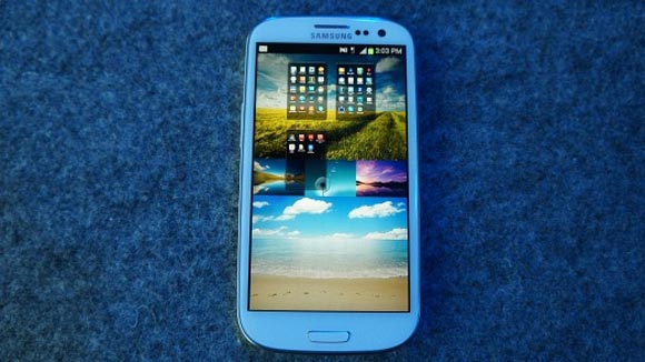
A lot of work has gone into the TouchWiz UI. It is a lot more appealing now, visually. Also, the widgets behave in a different way. You will be able to see in the screenshots (further below) as well as the hands-on video what we are talking about. An addition to this is also the S-Suggest widget, that refreshes to offer you more apps based on your preferences.
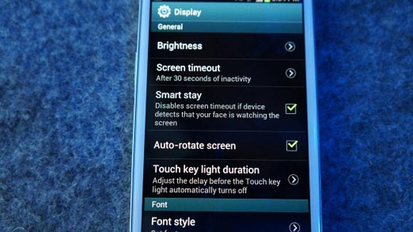
What we need to use and test in detail are the features like S-Voice, the burst mode of the camera as well as Smart Stay. With S-Voice, Samsung has an Apple's Siri-esque voice assistant on the phone. The company says that it works well with Indian accents as well. The demos indicated that it did, but we will test that in greater detail. Smart Stay is the feature that allows you to use the phone and not worry about the display turning off in the middle of reading something important.
Samsung has priced the Galaxy S III at Rs 43,180. It should be available in stores from today, but that is only for the Marble White version. The Pebble Blue version will be hitting stores in India sometime next week.
Click NEXT to check out Samsung Galaxy S III's features in pictures.
Samsung Galaxy S III: First Impressions
Smart Stay feature can be enabled or disabled.
Samsung Galaxy S III: First Impressions
Some say it is plasticky, but the finish and feel is premium.
Samsung Galaxy S III: First Impressions
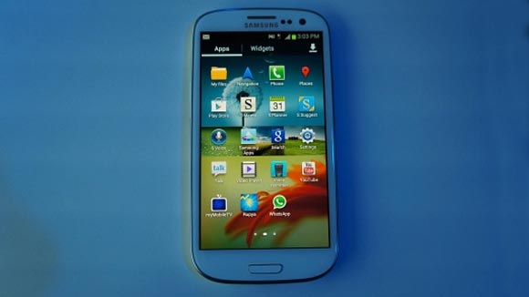
The apps menu...
Samsung Galaxy S III: First Impressions
How it looks from the front
Samsung Galaxy S III: First Impressions
The S-Suggest widget
Samsung Galaxy S III: First Impressions
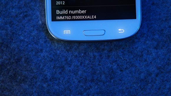
The touch sensitive keys have a classy white backlight
Samsung Galaxy S III: First Impressions
Touchwiz has been slightly tweaked -- 1
Samsung Galaxy S III: First Impressions
Touchwiz has been slightly tweaked -- 2
Samsung Galaxy S III: First Impressions
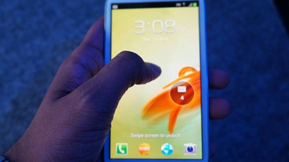
Unlocking the display
Samsung Galaxy S III: First Impressions
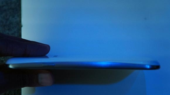
Very sleek and slim form factor
Samsung Galaxy S III: First Impressions
Even the app list menu can do the multiple home screen jig!
Samsung Galaxy S III: First Impressions
How widgets react on the home screen
Samsung Galaxy S III: First Impressions
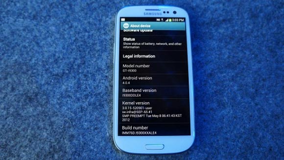
More details about the S III
Samsung Galaxy S III: First Impressions
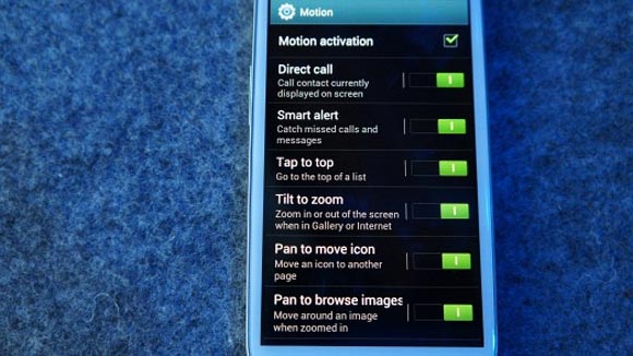
Motion control settings menu
