 | « Back to article | Print this article |
Tips to make your resume stand out
In an earlier article we told you what fresh graduates must include in their CV, in the following pages we tell you how to present your resume.
While writing your resume, it is important to understand that there are various formats you can choose from. You must pay attention to the format and structure the layout accordingly with the right fonts and highlights.
It is important to choose the format of your resume carefully, because an inappropriate format can harm your chances of clinching an interview.
Although there are four formats, namely Chronological, Functional, Chrono-functional and Targeted, remember that these formats are not rigid.
The information contained in all of the above is essentially the same, the difference lies in the order in which it is presented.
Please click NEXT to continue reading...
The Chronological Resume
Are you goal-oriented and have a steady employment history? A chronological resume will help accentuate your career.
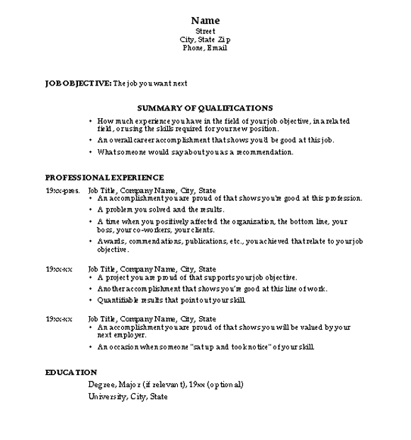
The most common resume format, it focuses on education and employment history, both of which are listed in reverse chronological order, with the most recent degree/job being mentioned first.
Employers generally like this format, because it is clear and the information they are most interested in (current/last job, most recent educational qualification) is highlighted up front. In this format, you do not divulge information about your marital status or provide details of your family, school and university addresses. It also excludes minor qualifications that are unrelated to the post applied for.
Who can use this format?
The chronological resume is applicable for those professionals who have a long career history and want to focus on their career growth. By listing your experiences in a chronological format, you give your prospective employer the impression that you are goal oriented thus emphasising on your intended career path.
It is the most sought after format by international recruiters.
This format is not advisable for those who have a gap in their education or job experience. For example, if you took a break from work for a year, the employer may notice it immediately in this format.
The Functional Resume
Skipped too many jobs in the last few years? The functional resume may just be perfect for you.
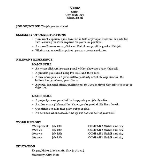
The functional format focuses on your skills, qualifications and employment experience. It is less popular but is useful if you have had a varied employment and educational background.
For example, if you have a degree in Mathematics and have done several diploma or certificate courses in computer applications, know three or more foreign languages and have experience in translating technical user documentation, this resume would work well for you.
Who can use this format?
This format is advantageous for professionals who took a break in their education or work experience. Since it focuses on your skills and responsibilities, it may also save you from being labelled as a job-hopper.
This could also be the safe-bet for entry-level candidates who want to draw attention to their skills and achievements.
The Chrono-functional Resume
If you have a good mix of academics, work, volunteering and internship experiences, you might want to consider the chrono-functional resume format.
This format gives you the best of both worlds: it helps you identify the skills you have and focus on the objective.
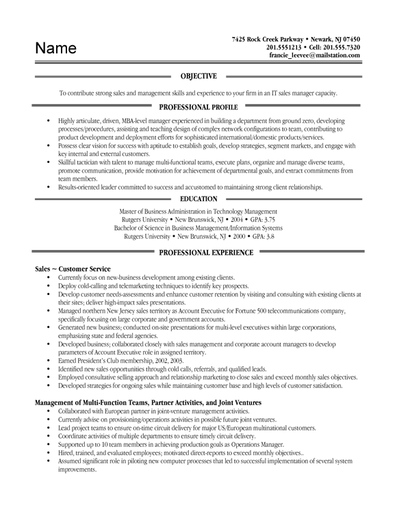
As the name suggests, it is a combination of chronological and functional styles. Generally, this resume begins with a short candidate profile, which is a summary statement highlighting your most important marketable attributes. This is followed by your skills related to each employment and education.
You may begin with your latest experience by summarising your responsibilities and achievements in three to four lines. Think of specific functions and skills and add relevant awards and achievements accordingly.
Ensure that you list the most important skills or accomplishments first.
Who can use this format?
This is the sought-after format by professionals who have a considerable job history and want to highlight the skills they have acquired over the years. Entry level candidates should not use this format.
The Targeted Resume
If you are definite about the job you want, the targeted resume is best designed for your needs.
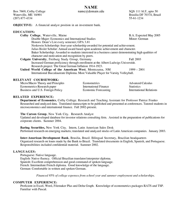
This format is built specifically for a particular job, and emphasises only those qualifications and skills that relate to that job. However, you must explain why you are the best fit for the position. Try and avoid information that is irrelevant to the job.
For example, if you are a fresh engineering graduate and want to make a career in coding and programming, you will highlight only those certifications, skills and achievements that are relevant to the profile.
Who can use this format?
This format may be best used if you are targeting or responding to a specific job opening. While several young graduates with a brief internship profile opt for the targeted resume format, it may not serve useful for those who are exploring multiple job profiles.
Content: Language, Style and Consistency
Clarity is the primary aim of a resume.
Your resume must indicate clearly what your background is, what skills you have and what your objective is. By looking at your resume, a prospective employer must be able to determine what jobs you are suitable for.
So the resume is not the place to show off your vocabulary, sentence structure etc. You must use language that is clear, unambiguous and forceful.
- Most of your information will be presented as bullet points, not as a narrative, so it is enough to use telegraphic language yet grammatical. For instance, do not write: My area of specialisation was Database Management Systems. Instead write: Specialised in Database Management Systems
- Avoid use of the pronoun 'I'. You can begin each point with a verb instead. As your name appears in the header, the resume is obviously yours. Then what is the necessity of using the pronoun 'I' throughout?
For example, instead of writing: I was instrumental in raising a fund of Rs 1 lakh for Tsunami victims, write: Raised a fund of Rs 1 lakh for Tsunami victims. - Use strong, positive verbs to describe your achievements. Use verbs like managed, participated, completed, developed, led, conducted etc.
All resumes must be neatly typed
After having the content in place, now you have to think about presenting it in a neat, attractive way.
The look of the resume is as vital as the content. Once the content is ready, you must think about the visual format.
Just as the language you use is aimed at achieving maximum clarity, the design and layout you use should aim for neatness and ease of reading.
All resumes must be neatly typed. For entry level candidates, the resume need not exceed to two or three pages.
Typography: Use a standard font in a readable size (14 point is preferable for headings and 12 point is a standard size for the normal content. Some of the acceptable fonts are Times New Roman, Bookman, Ariel, Calibri, Palatino and Garamond.
Subheadings: Use subheadings in a contrasting font in order to be distinctive from the rest of the content. You may either use bold or underline but don't use both. Use a font like Helvetica or Arial for subheadings.
Indentation: Below each heading, organize your information in the most reader-friendly format.
Lines: Use lines to separate different blocks of information only if you think it improves readability. If you want to separate education, experience, community services etc., a line would serve this purpose well.
Bullets: For blocks of information where you have a list of entries that are not set apart by date, identifying different entries with the help of bullet points is a useful and attractive layout detail.
White Space: A text heavy page, laden with mass of black print and lines without much space between subheadings and content may not look neat and readable. Use white space to provide demarcations between sections of information and to simply give the reader some visual relief.
Paper: Use standard office paper (A4 size papers)
Proof Read: Review your resume at least twice or thrice and make sure that it is free of grammatical and typographical errors. It would be better if you could ask your friends or professors to review it meticulously before taking print outs.
Printing and Copying: Print out at least 20 copies of your resume with a high quality print using a good Laser Jet printer. However, do not print multiple copies until you are sure you have a good, impressive resume.


