 | « Back to article | Print this article |
Airtel: Spend on customer service or brand makeover?
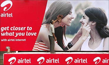
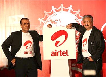
Airtel has a new identity, complete with a new logo and, for the first time, a symbol.
A new television campaign, shot in Prague with models fresh out of acting school, is on air; its international look and feel is unmistakable.
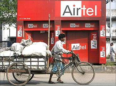
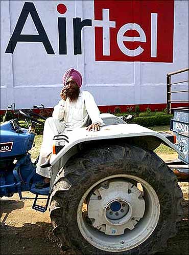
The old Airtel logo has more or less been replaced at all shops and billboards in the country, television shows, cricket fields et al. It's a huge exercise but nobody will tell how much it cost.
Airtel: Spend on customer service or brand makeover?
The jury is still out if Bharti Airtel has got it right. The comments on cyberspace, says Bharti Airtel Head (brand & media) Mohit Beotra, are 70 per cent positive and 30 per cent negative.
All this money, the naysayers have argued, could have gone into improving customer service and decongesting the network.
Click NEXT to read on
Airtel: Spend on customer service or brand makeover?
"Any good symbol should be describable; if you can't describe it, you have lost half the battle," adds Leo Burnett India National Creative Director KV Sridhar. "For example, the Vodafone symbol represents a quote or a speech blurb, and is therefore something that people can recognise. With Airtel you don't know what the symbol is."
Bharti Airtel is convinced it has got it right. The new symbol, says Kapoor, is an interpretation of the A in Airtel and shows the company's willingness to embrace anything new.
Airtel: Spend on customer service or brand makeover?
Click NEXT to read on
Airtel: Spend on customer service or brand makeover?
Third-generation mobile services too will kick off soon. Companies like Bharti Airtel that have paid a bomb to buy spectrum must ensure there is adequate return. The brand that positions itself right will walk away with the new business.
With mobile telephony set to undergo a paradigm change, Bharti Airtel decided to be the first off the block with a new look. "When you change proactively you are more in control than when you are pushed into it," says Kapoor. "It is for the right reason; so we are not apprehensive of the change."
Kapoor says there's more to it.
Airtel: Spend on customer service or brand makeover?
How they did it
The work on the makeover started some six months back, before the Zain acquisition was announced, though it was on the cards. Earlier in the year, it called a pitch from the world's top brand specialists. Four made elaborate presentations.
Finally, Bharti Airtel selected Brand Union. Actually, the company was no stranger to Brand Union - the two had worked together on some projects since 2005.
In mid-April, Brand Union for the first time met the five-member Bharti Airtel Brand Council led by Kapoor. The agency was given the makeover brief but with the caveat that the red colour should be retained.
Click NEXT to read on
Airtel: Spend on customer service or brand makeover?
"We did some research which showed that red was an incredibly positive colour in Africa. You look across a lot of the African markets and you see they have used blue and purple or green as important telecom colours. So red was a differentiator," says Brand Union CEO Simon Bolton. This was the starting point.
Brand Union, in turn, wanted to know to what extent was Bharti Airtel ready to change on a scale of 1 to 5, 1 represented the subtle changes Google makes and 5 the metamorphosis of British Petroleum into BP.
Click NEXT to read on
Airtel: Spend on customer service or brand makeover?
The next task was to find a symbol - something that Airtel lacked. "We were looking for one that was young, dynamic and warm. We wanted an identity beyond the way Airtel was written. The earlier logo was slightly older," says Beotra.
The task wasn't easy; in its attempt to connect with the youth, it could not afford to alienate others. The logo and the brand had to be inclusive.
Click NEXT to read on
Airtel: Spend on customer service or brand makeover?
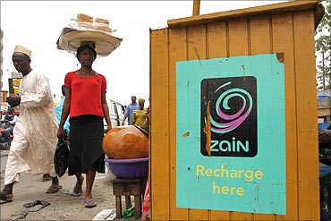
"We wanted something that is as vibrant as the work of Anish Kapoor. We also thought about Zain; so we wanted some subliminal connection to what the brand had been in Africa. If you look at the Zain logo, it is a swirl that comes from the solar system."
Brand Union presented close to a hundred symbols to the Bharti Airtel Brand Council. Two were shortlisted and shown to Mittal who selected the one in use. For further validation, a large set of customers was shown the two symbols.
Click NEXT to read on
Airtel: Spend on customer service or brand makeover?
Bharti Airtel has now launched an online competition to name the symbol. An internal team will select about half a dozen entries, and then put them up for popular vote on the internet. According to Beotra, in a few days after the launch, there were as many as 7,200 entries.
Brand promiseThe next task for Brand Union was to refine the Airtel brand promise of magic happens when people talk. Two options were given: Dil jo chahe paas aye (what your heart wants comes closer) and dil jo chahae paase laye (what your heart wants is brought closer). Again, the company went to the customers with both the lines; they selected the second one.
Click NEXT to read on
Airtel: Spend on customer service or brand makeover?
So, the company knew how the agency worked. Madison was brought in for media and webchutney for digital communication.
"The brief from Airtel was that 'connections' is the heart of what mobility does. Right at the onset, we wanted to break a little from the past so that the viewers see a new Airtel and see the new idea without any celebrity," says JWT Managing Partner Rohit Ohri.
Click NEXT to read on
Airtel: Spend on customer service or brand makeover?
All this perhaps was the easier part. The Bharti Airtel Brand Council then sat down to identify the touch points that needed to be changed with the new identity - the list was 650-strong from glow signs on shops to drop boxes, billboards, letterheads, identity cards, visiting cards et al.
Click NEXT to read on
Airtel: Spend on customer service or brand makeover?
A lot of this work was outsourced. Stationery with the old logo was stopped some time before the launch. Television shows sponsored by Airtel posed a peculiar problem because they are shot a month in advance.
So, the old Airtel props were removed well in advance.
Click NEXT to read on
Airtel: Spend on customer service or brand makeover?
These people were told that within a fortnight of the launch, the new brand identity should cover every nook and cranny of the country. Sri Lanka, Africa and Bangladesh will come next.
Of course, some of the stock in the market - SIM cards, set-top boxes etc - still carries the old Airtel logo; so do locked devices like the Apple iPhone and BlackBerry handsets (the logo of the service operator comes on the screen when the device is switched on).
These customers will have to wait till they buy a new handset for the new logo.
Click NEXT to read on
Airtel: Spend on customer service or brand makeover?
"It's not a cosmetic identity change. The way we work will change after this. We have to change our processes, systems, investments and information technology to support this change," says he.
"At any time, we watch the company and gauge it on a balanced scorecard. It includes customer advocacy and satisfaction, employee engagement and satisfaction, process improvement and financials. The organisation and performances are being evaluated on all these parameters."
According to him, Bharti Airtel performs better than others in consumer satisfaction, employee satisfaction and financials.
Mobile telephony just got a little more interesting.
