 | « Back to article | Print this article |
A look at how companies rebrand with new logos
Many companies around the world have rebranded themselves by changing their logos.
Let's take a look at some of these companies and their changed logos.
NOTE: Old logo is at left and new logo at right
Click NEXT to read more...
A look at how companies rebrand with new logos

Air India, the national carrier, flew with the old logo until 2007.
Click NEXT to read more...
A look at how companies rebrand with new logos
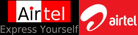
Airtel opted for the new logo after making foreign acquisitions.
Click NEXT to read more...
A look at how companies rebrand with new logos

Kingfisher dropped the good times in the new logo.
Click NEXT to read more...
A look at how companies rebrand with new logos
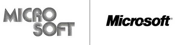
Microsoft opted for the new look with a new logo.
Click NEXT to read more...
A look at how companies rebrand with new logos
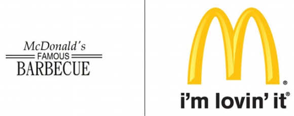
McDonald's had a very different logo from the iconic one it now has.
Click NEXT to read more...
A look at how companies rebrand with new logos
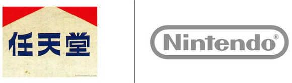
Nintendo changed its all-Japanese logo to an English one.
Click NEXT to read more...
A look at how companies rebrand with new logos

Car manufacturer Nissan dropped the red colour all together from its logo.
Click NEXT to read more...
A look at how companies rebrand with new logos
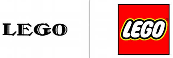
LEGO, meanwhile, added the red colour to its new logo.
Click NEXT to read more...
A look at how companies rebrand with new logos
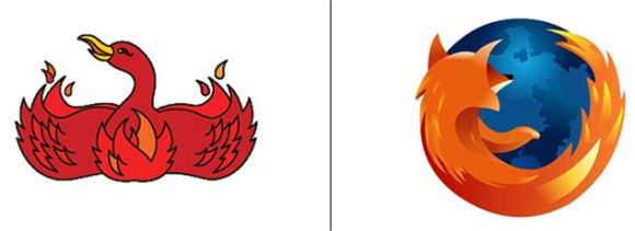
Mozilla changed its Phoenix bird to a totally different logo.
Click NEXT to read more...
A look at how companies rebrand with new logos
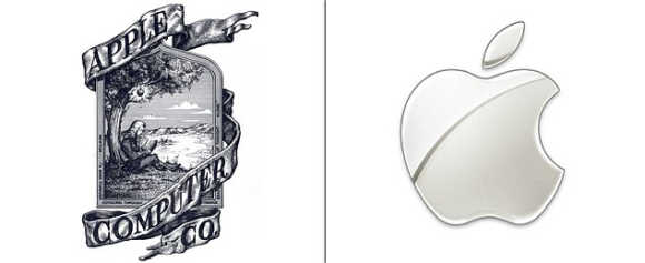
Apple's old logo was completely different from the now famous one.
Click NEXT to read more...
A look at how companies rebrand with new logos
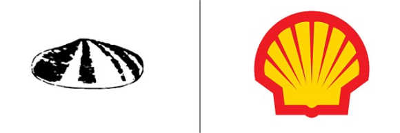
Oil giant Shell too went for a completely new look.
Click NEXT to read more...
A look at how companies rebrand with new logos
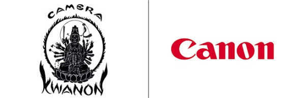
The new Canon logo looks much better than the odd one it earlier sported.
Click NEXT to read more...
A look at how companies rebrand with new logos
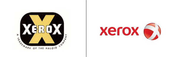
Xerox dropped the big X from the centre, which turned out to be a good move given that a big X is usually used by companies that are into adult business.
Click NEXT to read more...
A look at how companies rebrand with new logos
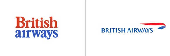
British Airways' new logo is much more visually appealing than the old one it had.
Click NEXT to read more...
A look at how companies rebrand with new logos
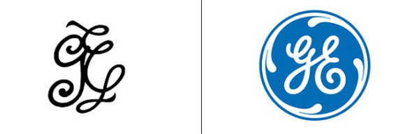
General Electric added colour and changed the design of the new logo.
Click NEXT to read more...
A look at how companies rebrand with new logos
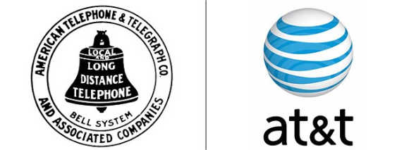
AT&T made its new logo simpler by reducing the number of words and changing the design.
Click NEXT to read more...
A look at how companies rebrand with new logos
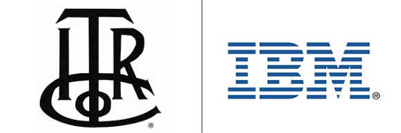
IBM's new logo is completely unrecognisable from the old one.
Click NEXT to read more...
A look at how companies rebrand with new logos

Car manufacturer Mazda gave its logo a new look.
Click NEXT to read more...
A look at how companies rebrand with new logos
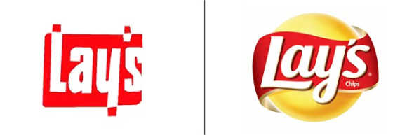
Lays changed its design and added the word chips to the new logo.
Click NEXT to read more...
A look at how companies rebrand with new logos

Discovery Channel went for a complete overhaul of its logo.
Click NEXT to read more...
A look at how companies rebrand with new logos
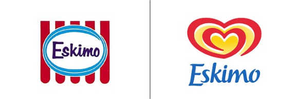
Eskimo rebranded itself by going for a new logo.
Click NEXT to read more...
A look at how companies rebrand with new logos
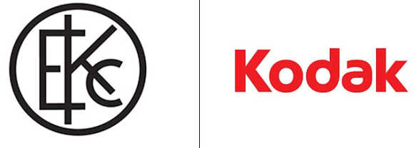
Kodak went for a simpler logo instead of the complicated one it previously had.